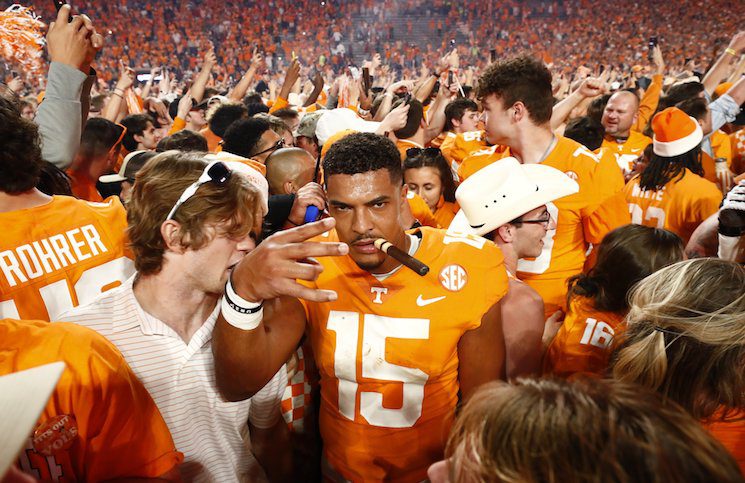
The hour has now come and gone. Nike and Tennessee stole the collegiate athletics spotlight for a few hours yesterday afternoon as the two officially unveiled their new partnership and gave fans a highly produced view of the new-look uniforms for all athletic teams at the university. They also gave some rhyme and reason to many of the new designs, color choices, materials, fonts…etc. just as we all thought they would.
And now we get to dissect it. If social media is any indication, then fan reactions are quiet varied and scattered all across the board between “I hate it. Burn them with fire.” on one end of the scale, to “OMG OMG OMG!!! These are the GREATEST JERSEYS EVER!!!” on the other.
The truth probably lies somewhere in between, but regardless of where you stand on the new uniforms – for any of the sports – yesterday was a pretty big day for Tennessee.
Tennessee is now partnered with the athletic apparel Mecca. Nike is IT when it comes to the latest and greatest gear, not only for players and coaches, but fan apparel as well. Tennessee’s partnership with Nike as a “Nike Elite” school – one of only nine schools to claim such status – ensures that the school and it’s athletic teams will receive the newest high-quality gear and more of it, as well as a higher profit percentage off of merchandise sold in the retail market. That’s a big deal for an athletics department that was operating in the red as recently as 2012 – until some reallocated funds from the university pulled them out of it.
The added promotion Nike will offer is also far greater than anything Adidas was capable of, but all that stuff is for a different article. I want to talk about the football uniforms. Not because I don’t care about the uniforms in other sports, but because none of them are as singularly iconic as the football uniforms at the University of Tennessee. Basketball uniforms change every year for both men’s and women’s sports – or, at least they did under Adidas – and most other sports featured various changes on a semi-regular basis. Football, however, has remained largely unchanged (with a few notable exceptions here and there) since the 1940’s. Think about that for a second. That’s a lot of pressure on Nike to get it right…the first time.
The questions I was asking myself up until yesterday was, “Can Nike capture what makes Tennessee who they are? Can they honor tradition while also bringing Tennessee up to speed with some of the more modern looks in college football? Can they do enough without doing too much?” That last question stands out to me. That’s a small sweet spot to hit when you have a fan base as large and as dialed in as Vol Nation has been, is, and will continue to be.
After having some time to digest what was revealed yesterday, the answer for me is a resounding “Yes.”
Are there some things that I – and others – would tweak if it were our decision? Sure. But when taking a step back and considering that yesterday was phase one of the switch, and day one of a partnership that is likely to last for the next decade at the very least, how can you call it anything but a success? Nike didn’t turn Tennessee into Oregon, as many feared they would. Rather, they enhanced nearly all of the things that make them Tennessee.
Is it perfect? No. Is it a huge step in the right direction? Without question.
Nike made “Tennessee Orange” a priority – something that Adidas never seemed all that concerned about. (And don’t take my word for it, look at the variations of orange between 1997 and 2014.) Nike’s “Tennessee Orange” is consistent. It’s clean, it stands out, and it looks and feels like Tennessee. That may seem like a small thing, but that type of consistency and attention to detail is important in brand consistency and recognizability.
Nike incorporated the checkerboards into the uniform in a way that makes sense and looks sharp, not clunky. If you don’t think that was a challenging task, I refer you to Adidas’ attempt at doing this last year – which was so bad that fan outrage caused the team to abort their plan to wear the jersey at all last season. The orange and white (and now, perhaps gray?) checkerboards are instantly recognizable and truly an iconic representation of Tennessee athletics. Placing sections of the checkerboards on the pants and the back of the helmet is enough to notice them, without being so over the top that they ruin a uniform. (Warning: clicking link may cause temporary blindness.)
Nike also found a way to make an alternate helmet work. Since Adidas unveiled their smokey gray uniforms two years ago, a large contingent of fans – and even some “higher-ups” within Tennessee’s circle – were adamant that any change whatsoever to the helmet would never work. Many simply touted “tradition” as the lone reason that an orange ‘Power T’ on a white helmet should be all that Tennessee ever plays in. Nike’s idea to feature a Smoky Mountain print on the new smokey gray helmet makes it unique to the region, unique to local culture, and unmistakably “Tennessee.”
That’s what everyone was hoping for, right? Being unmistakably Tennessee? Because if that was the goal, then yesterday’s unveiling deserves a check-plus…or should that be a Swoosh-plus?


